Shaping a sustainable commerce experience through research and early UX strategy.
What began as an idea for my own business grew into a UX case study grounded in real user needs, emotional friction, and market gaps — and helped me make a confident, research-backed decision about how (and whether) to move forward.
Role: UX Researcher
Scope: Discovery, user research, competitive analysis, empathy mapping, product vision
Timeline: 6 weeks, part-time
Focus: Reducing decision fatigue • Supporting eco habits • Building trust through clarity
Overview
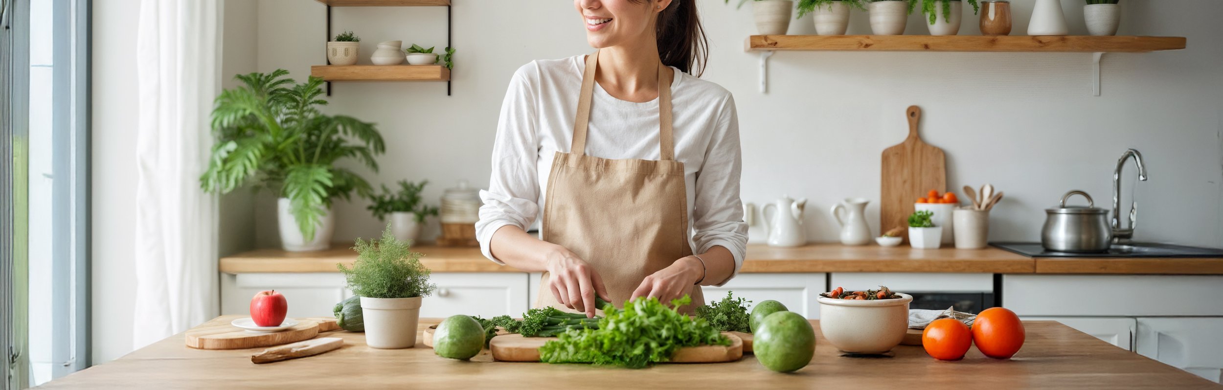
Svale is a new eco-conscious kitchen brand offering curated bundles of certified, non-toxic tools. Its mission is to help people transition to a plastic-free kitchen without the usual stress — no endless research, no confusing claims, just clear, healthy choices in one place.
Rather than competing on price or convenience, Svale focuses on quality, transparency, and thoughtful curation, designed for people who care about health, aesthetics, and sustainability, but are overwhelmed by greenwashing and cluttered product catalogs.
The Challenge
The eco-kitchen space is crowded, from IKEA to Amazon and full of products wrapped in green promises. The real challenge wasn’t launching yet another e-commerce site. It was creating a clear, credible, and trustworthy experience that helps users feel confident in what they’re buying, especially in a market full of vague claims and overwhelming options.
I had to cut through the noise, guide people toward smarter choices, and make them feel like they’d finally found a brand that understands what “safe” and “eco” really mean.

My Role
I led the UX research and product strategy for this project — from early discovery and competitor analysis to user interviews, empathy mapping, and product vision development. I explored real user needs, identified decision blockers, and shaped a concept for a trust-focused, low-friction e-commerce experience.
My goal wasn’t just to define features — it was to reduce cognitive overload, simplify choices, and lay the foundation for a shopping journey that feels clear, supportive, and aligned with sustainable values.
👋 Quick note before you dive in…
This case study walks you through a full, end-to-end UX research and strategy process for an eco-friendly e-commerce platform, from market analysis and competitor research to real user interviews, insights, and design decisions.
If you're looking for a detailed example of how I approach product thinking, structure messy information, and translate user needs into clear opportunities — this one’s for you. And just so you know, it’s a case study with a slightly different kind of ending.
Research & Discovery
The primary goal of this research phase was to explore how health-conscious users approach the transition to a plastic-free kitchen, what motivates them, what influences their purchase decisions, and what prevents them from trusting eco-friendly brands.
The research process was divided into two stages:
Market & Competitor Research: To explore market trends, evaluate competitor strategies, and uncover gaps in how eco-friendly kitchen products are positioned and communicated.
User Research: To understand user behaviors, motivations, and pain points through direct interaction with potential customers.
Market Research
Methodology:
Competitive Analysis: Explored the whole range of the kitchen market, diving into multiple competitors before narrowing it down to five examples
Customer Reviews & Blog Analysis: Reviewed customer feedback and blog discussions about eco-friendly kitchen products to identify common frustrations and expectations.
Social Media Sentiment Analysis: Explored how users discuss greenwashing and eco-friendly brands across social platforms.
To understand the eco-friendly kitchen market, I analyzed competitor strengths and weaknesses, customer feedback, and social media sentiment.
The goal was to uncover how brands, communicate trust, sustainability, and product quality and where Svale could stand out.

Competitive Analysis
I analyzed key competitors to understand how eco-friendly kitchen brands communicate trust, quality, and sustainability and to identify where Svale could stand out.
-
Strengths:
Clean, modern design with simple navigation.
Clear storytelling about their mission to reduce plastic.
Trust signals bages (plastic free, recyclable) are listed on product pages
English version
Weaknesses:
Limited product range of kitchen items (mostly food storage and bags).
Minimal educational content about material safety or certifications.
Focused mostly on zero waste, not on health benefits
Poor blog and items descriptions
Only local (NL) cheap shipping
-
Strengths:
Strong focus on durable, stainless steel products (water bottles, containers).
Clear emphasis on long-term value and sustainability.
Very strong storytelling about their mission and trustable signals
Limited edition items with interesting patterns
Weaknesses:
Narrow product range
Website feels cluttered with too many product variants.
Overhelming amount information about them, their mission, more content than about products
Poor blog
No english version
Shipping only in 4 countries
-
Strengths:
Wide product range (kitchen, home, personal care).
Strong SEO content description.
Cheap shipping and free shipping over 50€ option
Weaknesses:
Overwhelming product variety — no curation or guidance.
Minimal transparency about certifications or material safety.
Completely outdated design
Poor navigation—impossible to find products due to lack of filters and broken search functionality
No English version
-
Strengths:
Aesthetic simple site design.
Affordable pricing and wide range of products.
Professional product photos
English version
Weaknesses:
No clear explanations of certifications or material safety, poor items description.
Bundles are rare and lack intentional curation.
Extremely high price on delivery
Key Insights
Most competitors emphasize sustainability and zero waste but rarely highlight health safety, the primary driver for many users.
Big retailers prioritize convenience and affordability over transparency and product safety. Also many of them sells everything from furniture to clothing, making it hard to find what you need.
Many niche kitchen brands offer overwhelming product ranges, mixing eco-friendly items with less sustainable options. This lack of curation makes it hard for users to find and compare truly safe, non-toxic products.
Certifications like BPA-free are commonly used as marketing labels but often lack clear explanations of their significance.
Users struggle to differentiate between genuine eco-friendly products and eco-friendly buzzwords.
Pre-designed bundles sometimes marketed as starter kits, but customers express skepticism about whether all included items are essential or if the bundles are used to offload lower-demand products.
Niche small brands often communicate their values more transparently, but their product ranges can feel disjointed, offering items that are either unnecessary, poorly designed, or lack the cohesive aesthetic modern shoppers expect.
User Research
Methodology:
User Interviews: Conducted 5 in-depth interviews (1 male, 4 female) with health-conscious users actively seeking safer kitchen alternatives.
Interview Script & Prompts: Focused on motivations, hesitations, expectations, and attitudes toward bundles, certifications, and shopping experience.
Empathy Mapping: Synthesized qualitative data into empathy maps to capture how users think, feel, say, and do, highlighting emotional drivers and hidden frustrations.
Persona Development: Defined 3 provisional personas based on common behaviors, goals, and barriers, and refined them into a general persona to guide UX decisions.
To understand what motivates people to switch to eco-friendly kitchen tools and what holds them back. I conducted interviews with potential customers. The goal was to uncover real behaviors, trust signals, and decision-making patterns that could guide both product and UX strategy.

Provisional Personas
I created provisional personas at the start of the project to clarify our early assumptions and better understand who we were designing for. They helped shape the interview script and guided the selection of participants, making sure we covered a range of motivations and behaviors. These early profiles gave structure to the research and were later refined based on real insights.
-
Represents users who prioritize health over sustainability and need clear, authoritative guidance.
Goals:
Eliminate plastic from her kitchen to protect her kids from toxins.
Find products that are 100% safe and easy to clean.
Pain Points:
Overwhelmed by conflicting information about materials (e.g., “Is bamboo really safe?”).
Worried about wasting money on products that don’t last long.
-
Drives the need for curated bundles and time-saving UX.
Goals:
Quickly replace her plastic kitchenware with non-toxic alternatives.
Avoid decision fatigue with pre-vetted bundles.
Pain Points:
No time to compare products across websites.
Frustrated by bundles that include unused items.
-
Highlights the need for transparency and anti-greenwashing education.
Goals:
Create a kitchen that’s Instagram-worthy and eco-friendly. Avoid cluttered, mismatched tools.
Support truly sustainable brands, not just “green” marketing.
Pain Points:
Most eco-friendly products look “rustic” or cheap.
Feels deceived by brands that exaggerate eco-claims.
User Interview
Main research Questions:
What motivates users to switch to eco-friendly kitchen tools?
How do users verify if a product/brand is trustworthy?
What hesitations do users have about pre-designed bundles?
How does educational content influence purchase decisions?
-
Participant Criteria
Recruit 6–8 participants who match Svale’s target audience:
Demographics: Women aged 25–45 in Europe.
Behaviors:
Shops online for kitchen/home products.
Interested in sustainability or family health.
Exclude: Users who exclusively buy from big-box retailers like IKEA.
Interview Structure
Introduction (Icebreaker)
Explaining the purpose: “We’re designing a kitchen brand focused on safety and simplicity. Your feedback will help us create a better experience!”
Can you tell me a little about yourself and your daily routine in the kitchen?
How important is it for you to have eco-friendly or non-toxic products at home?
Current Habits & Pain Points
When did you first start thinking about switching to eco-friendly kitchen tools? What was the reason?
Have you already replaced some items in your kitchen? Which ones and why?
What usually stops you from buying eco-friendly products?
How do you search for information before buying kitchen tools?
Trust & Decision-Making
What makes you trust one brand more than another when it comes to eco-friendly products?
Do you pay attention to certifications like BPA-free or food-grade? How important are they for your decision?
How do you feel when brands use labels like eco-friendly or sustainable without explanations?
Do you prefer reading product details or trust visual symbols and short labels?
Bundles & Shopping Experience
Would you prefer buying a bundle of eco-friendly kitchen tools or selecting each product separately? Why?
What would make a bundle more attractive to you — price, design, or convenience?
Would you like to read why exactly these products were selected together or just trust the brand’s expertise?
Final Thoughts
If you could imagine your ideal eco-friendly kitchen shop — what would it look like?
Is there anything that would make you switch to an unknown eco-friendly brand without hesitation?
Results:
In total, 5 participants (1 male and 4 females) were interviewed. After conducting user interviews, the gathered insights provided a deeper understanding of customer motivations, trust signals, and pain points when choosing eco-friendly kitchen tools. The results validated key assumptions and revealed patterns that helped shape Svale's UX and product strategy.
Empathy map
To better understand our audience, I created an empathy map based on interviews. It helped clarify user motivations, pain points, and expectations, and guided how we shaped key product decisions.


General persona
After the interviews, I combined recurring patterns and behaviors into a single general persona to represent Svale’s core user. This persona helped focus design decisions around real needs, priorities, and frustrations, especially related to trust, convenience, and product clarity.
-
Emma
About
Emma recently become more aware of health risks associated with plastic and toxic materials and wants to make safer, eco-friendly choices for her family. However, she’s overwhelmed by conflicting information, skeptical of greenwashing, and doesn’t have time to research every purchase in-depth.
Age: 35
Location: Amsterdam, Netherlands
Occupation: Marketing Manager
Family: Married, one toddler
Income Level: Middle to high
Motivations
Protecting her family’s health
Avoiding the stress of uncertainty
Saving time while making responsible choices
Feeling good about her purchases
Investing in long-term quality
Feeling proud of a home that reflects both her values and her taste
Goals & Needs
Find a safe, non-toxic kitchenware without overwhelming research
Choose stylish, high-quality alternatives to plastic
Make informed, confident purchases
Buy everything she needs in one place, hassle-free
Invest in products that last, not just another eco trend
Select low-maintenance products.
Pain points and frustrations
Too much conflicting information – she feels overwhelmed by inconsistent claims about eco-friendly and non-toxic materials, making it hard to trust what’s truly safe.
Greenwashing skepticism – many brands use buzzwords like “eco” and “sustainable” without proof, leaving her unsure of what’s actually safe for her family.
Decision fatigue – — she doesn’t have time to compare endless products, materials, and certifications—she just wants a clear, trustworthy solution.
Compromising on aesthetics – — many non-toxic products look cheap or outdated— — she wants both safety and style without settling.
Fear of wasting money – She’s willing to invest in quality, but only if it’s truly durable and worth the cost— — not another overpriced eco-trend.
Behaviors
Shops online but often delays purchases
Skims product descriptions, focuses on key details
Relies on social proof and brand credibility
Avoids cluttered, unpolished websites that seem unreliable.
Compares across multiple retailers before committing
Prioritizes convenience and ease of use
Follows sustainability and lifestyle influencers
Prefers quality over quantity
UX Findings & Design Opportunities
Enhanced Transparency with Certification Details:
Users repeatedly mentioned frustration with vague eco-friendly claims. Providing clear, accessible information about certifications can help users understand exactly why each product is safe and superior.
Dynamic Bundle Customization & Explanation:
While pre-designed bundles offer convenience, users are skeptical about whether all items are essential. A dynamic bundle builder or an explanation overlay that details the rationale behind each item in the bundle can reassure users that every product has been thoughtfully curated for their needs.
Integrated Educational Content:
Interviews revealed that educational content, when presented in context, builds trust. Embedding short explainer videos, infographics, or blog excerpts directly on product pages (for example, a “Learn Why” link next to certification badges) can empower users to make informed choices without feeling overwhelmed.
Visual Trust Signals & Social Proof:
Participants expressed that clear visual cues like trust badges, certification icons, and user testimonials make them feel more confident in a product’s quality. Prominently displaying these elements across the site, particularly on the homepage and product pages, can serve as immediate reassurance.
Streamlined Navigation & Filtering:
Busy users need to find solutions quickly. Simplifying navigation with intuitive filtering options can reduce decision fatigue, ensuring that users quickly find the products that match their needs.
Personalized Recommendation Tools:
A brief interactive quiz or guided questionnaire can help tailor product suggestions based on individual preferences and kitchen habits. This personalization not only enhances the user experience but also reinforces that Svale understands each customer’s unique requirements.
Defining the Product Vision
Research insights are only valuable when they translate into clear product direction. This next section outlines how user needs, business goals, and technical constraints came together to shape Svale’s product strategy, from defining core goals to prioritizing features and structuring the site for a simple, trust-driven experience.
Project Goals
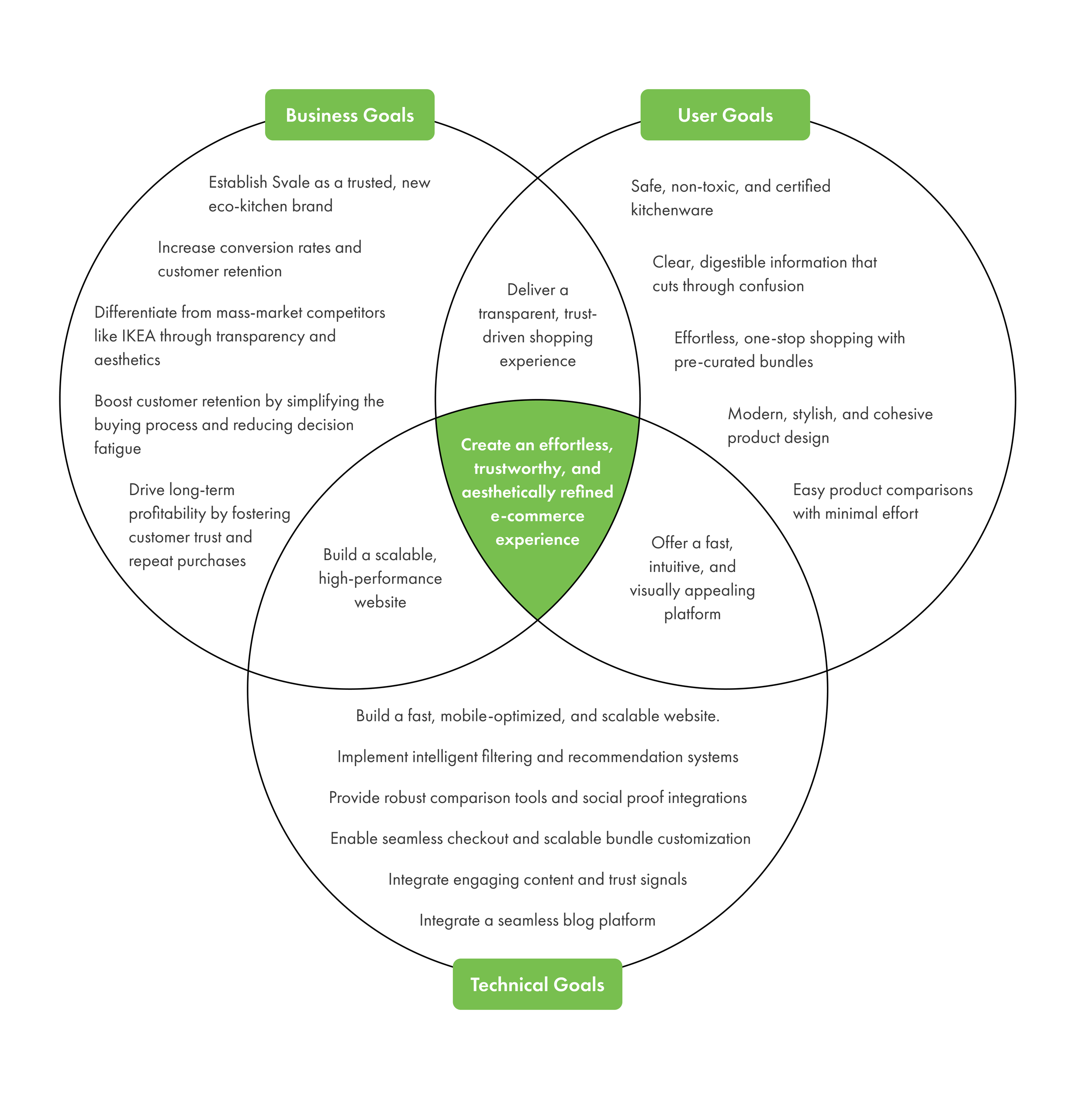
Drawing from research insights and business priorities, I defined five key goal areas: trust, simplicity, education, conversion, and growth. Each addressed a specific need, from earning user confidence to supporting long-term scalability — but they weren’t isolated.
They were deeply connected, with overlapping impact on user behavior, design choices, and content strategy. Together, they guided the product toward one clear outcome:
→ Create an effortless, trustworthy, and aesthetically refined e-commerce experience.
Feature Roadmap
This roadmap prioritizes features for Svale’s e-commerce platform based on user needs, business goals, and technical feasibility.
Features are grouped as follows:
Must-Have: Essential for delivering a trusted, seamless shopping experience.
Nice-to-Have: Enhancements that add personalization, accessibility, and deeper engagement.
Surprising & Delightful: Features that elevate user experience and brand differentiation.
Can-Come-Later: Future innovations for long-term growth
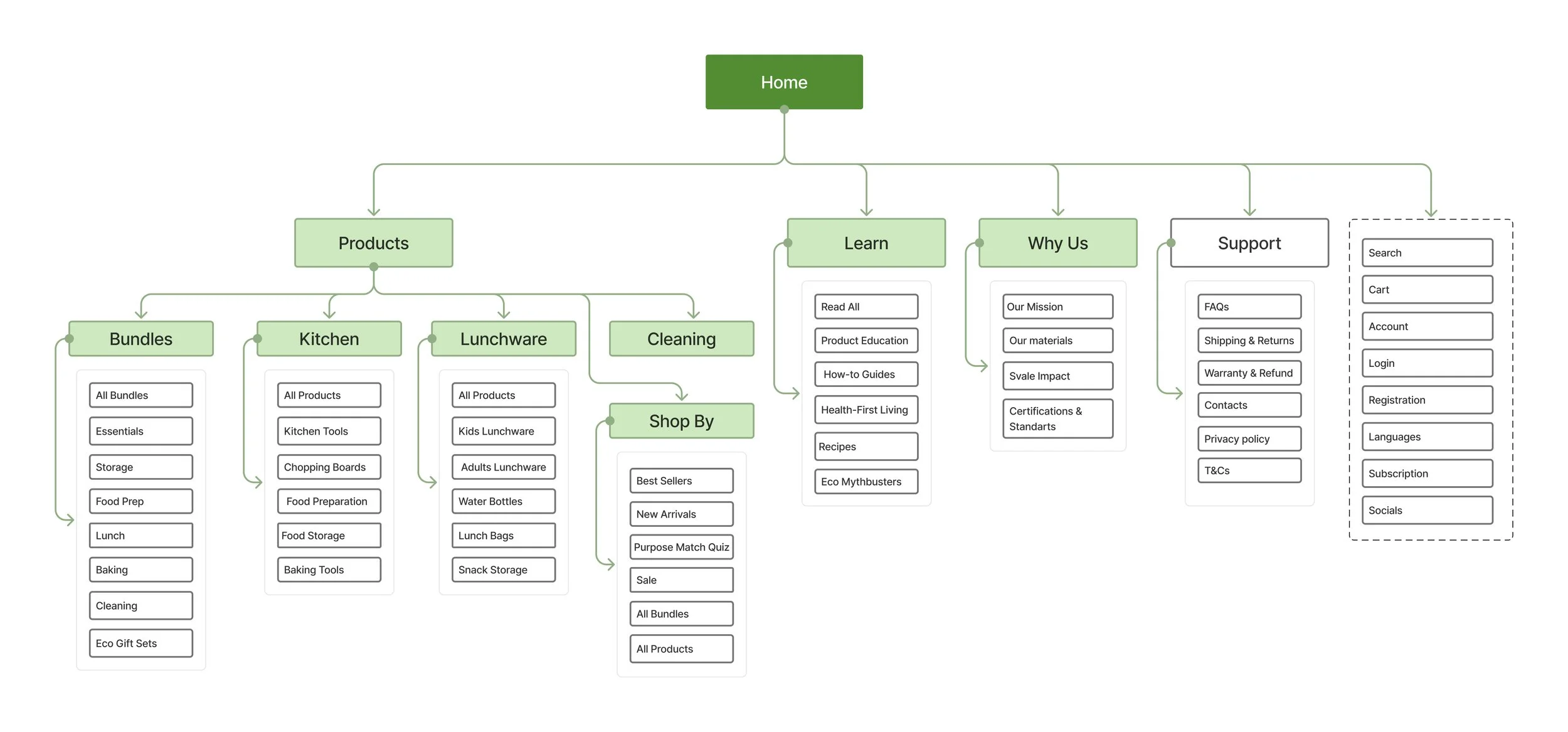
Sitemap
Wait, no screens? No wireframes?!
I hear you. But before we talk pixels, let me explain how this project really unfolded, and why the biggest outcome wasn’t a visual one.

Yep, that’s me, walking away from something I still believe in.
This One Ends a Bit Differently
You might be expecting a scroll of mockups or final UI, but the story shifted before we got there.
This project paused right after the research phase, because what we learned changed everything.
And that’s the part of the story I want to share.
This wasn’t a theoretical case study or a design challenge, Svale was a real project with real goals, real constraints, and two real people behind it: my husband and me. We truly wanted to bring this shop to life.
We researched suppliers, worked out logistics, explored storage options, estimated packaging costs, and analyzed margins. While I led the UX research and design, my husband focused on the financial and market side, and together we tried to answer the ultimate question: can we build something meaningful, useful, and financially sustainable enough to support our lives, not just our ideals?
The Hardest (and Smartest) Decision
From user interviews, we learned that most people don’t want to shop for eco-friendly items across multiple niche stores, they want a single place to buy everything: kitchen tools, cleaning supplies, baby products, personal care, and more. They want convenience, free shipping, and curated guidance , something that’s hard to deliver without scale.
At the same time, the cost of acquiring new customers in this space is incredibly high. Competing with marketplaces like Bol.com, IKEA, and Amazon meant we’d have to spend more on advertising than the products could earn back. And to offer the broad assortment users wanted, we’d need even more money, space, and time than we could realistically commit to as a small, independent team.
So in the end, we pressed pause.
Not because we lost interest, but because we gained clarity.
And yet, this project reminded me why I love UX in the first place.
It brought me back to the core of what we do: using research to reduce risk, aligning user needs with business decisions, and helping good ideas become real, or, in this case, helping two people realize that not launching was the right call.
Even if the shop stays paused, the process was real. The decisions were real. And the clarity it gave me — about the value of design, the weight of good research, and the importance of asking the right questions made it one of the most meaningful projects I’ve ever done 💚.